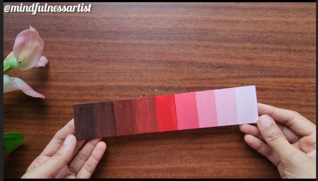
Once you’ve mastered the black and white value scale, it’s time to apply that knowledge to color! Just like black and white, every color has its own value—its lightness or darkness. Understanding a color’s value is essential for creating depth, form, and realism in your artwork. This exercise will help you understand how to manipulate a single color to create a full range of values.
Why a Color Value Scale?
A color value scale helps you see how a single hue changes when you add white to lighten it (creating a tint) or black to darken it (creating a shade). This is a foundational skill for artists because it allows you to accurately represent highlights and shadows on colored objects. By practicing this, you’ll become more confident in your color mixing and more precise in your painting.
Let’s walk through the process of creating a color value scale, using a vibrant red as our example.
Step 1: Prepare Your Materials
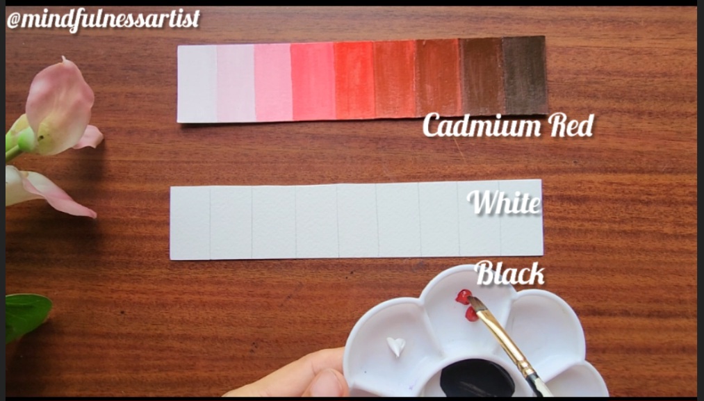
Start with a clean strip of paper, divided into equal sections, just like before. On your palette, you’ll need your chosen color (Cadmium Red in this case), as well as white and black paint.
Step 2: Establish Your Pure Color
In the middle of your scale, paint one box with your pure, unmixed color. This will be your midtone and the reference point for all your other values.
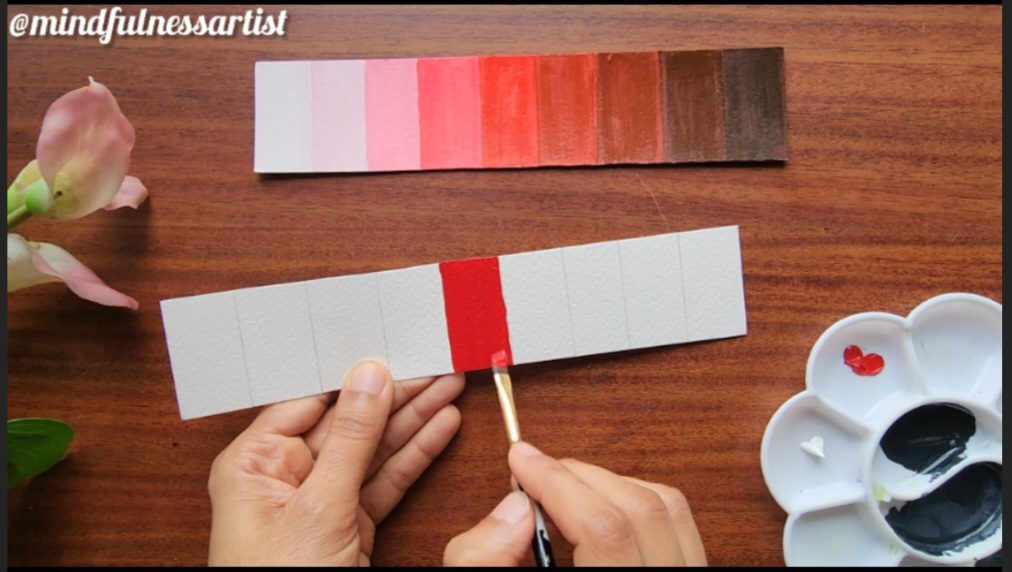
Step 3: Create the Darker Values (Shades)
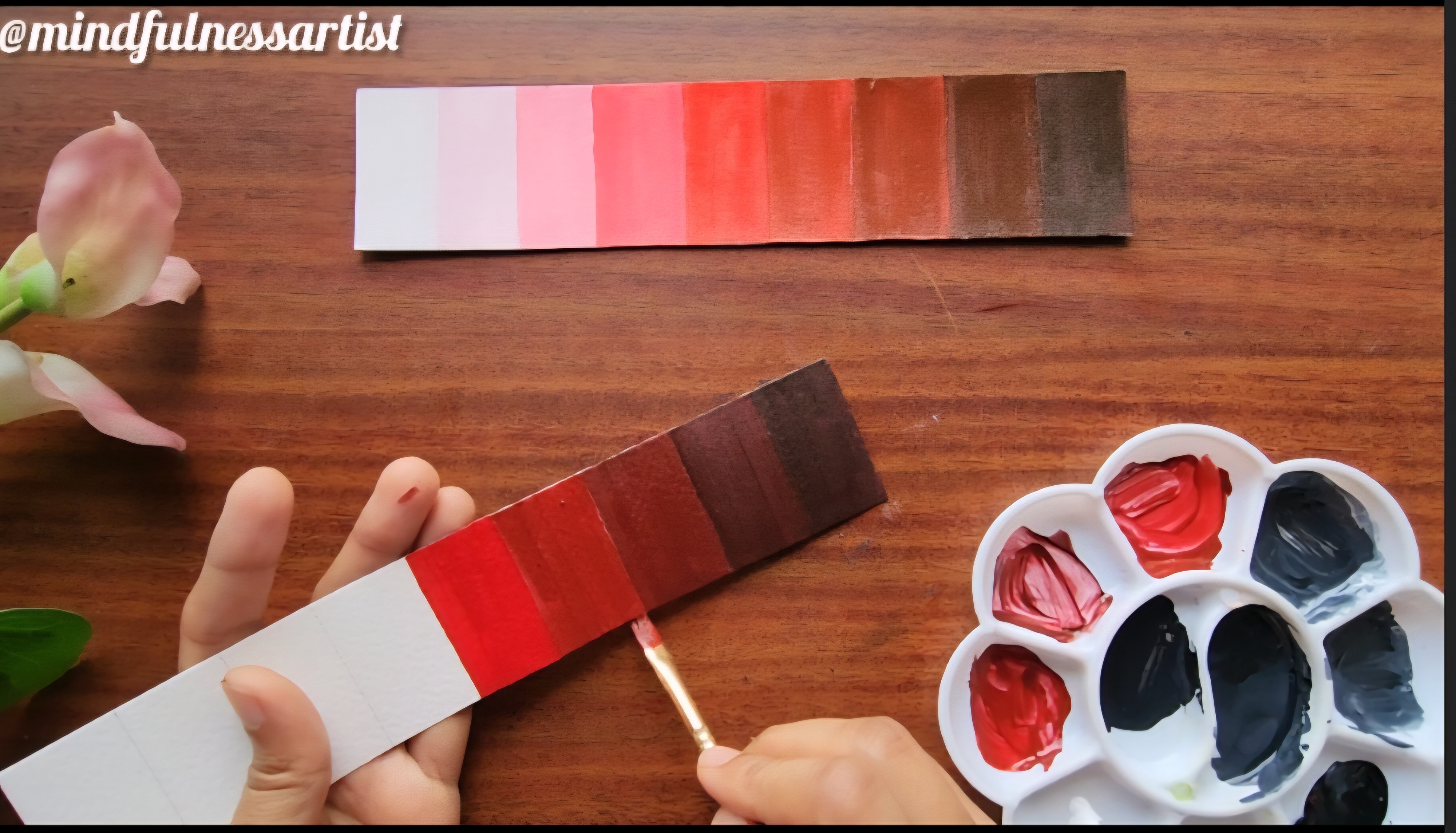
Let’s begin by establishing the darkest shade on our scale. The goal is to create a smooth gradient that transitions from a deep, dark red to your pure color.
To start, mix a significant amount of black into your pure red to create the darkest possible shade.
Paint this deep, dark red into the last box on your scale. This is your darkest value.
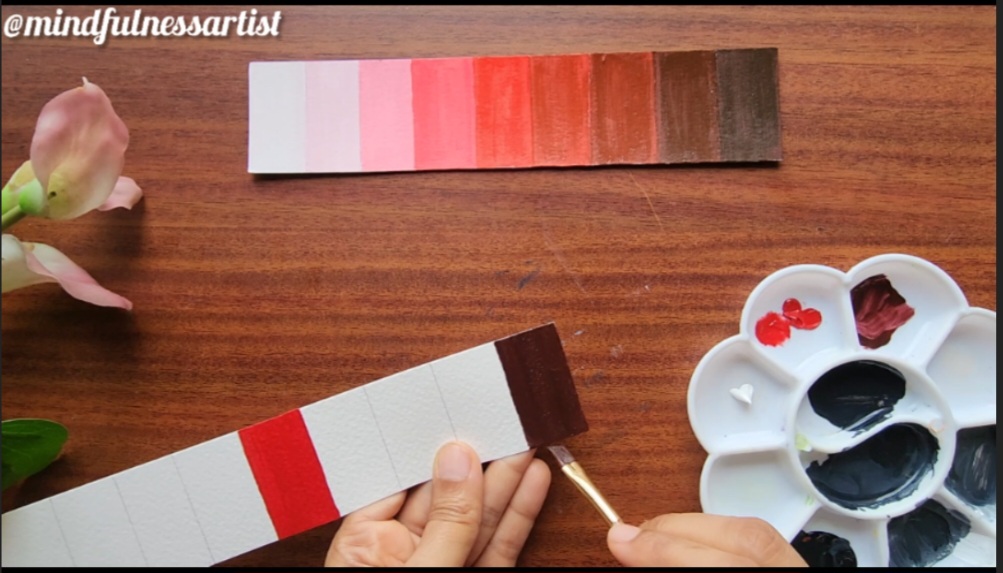
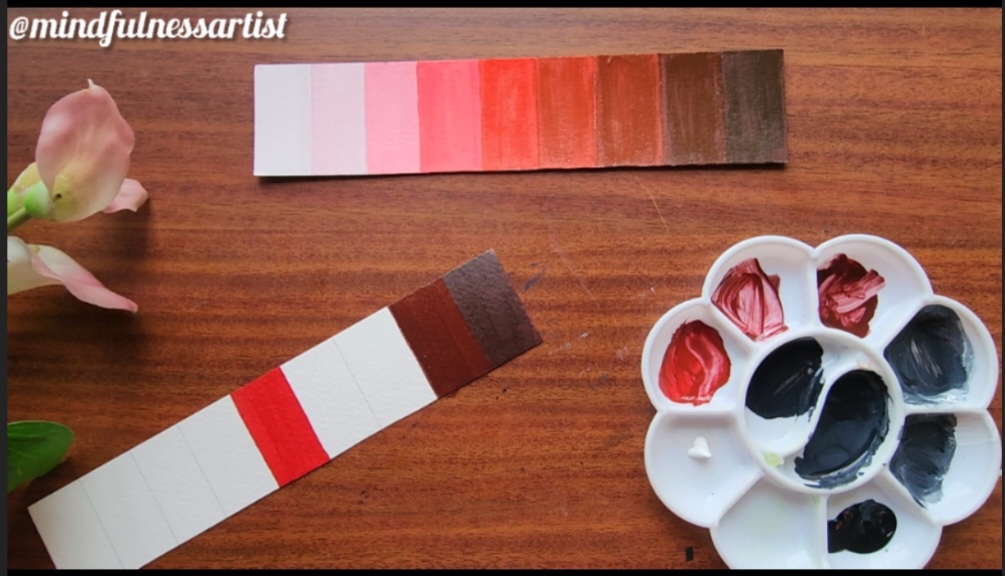
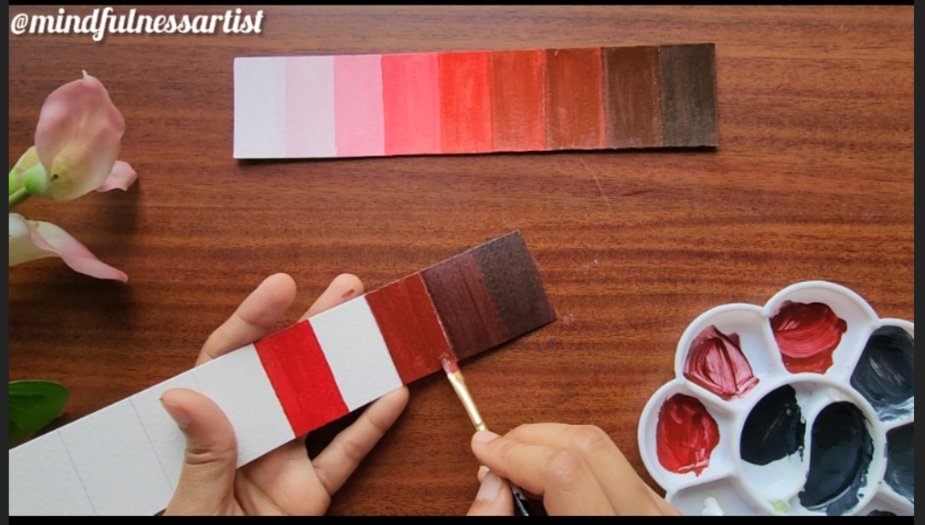
- Now, for each subsequent box, gradually add less black to your mixture, or add more red, to create a progressively lighter shade.
- Continue this process, building a smooth transition from the deep, dark maroon to your pure red in the center of the scale.
Step 4: Create the Lighter Values (Tints)
Now, let’s move to the lighter end of the scale.
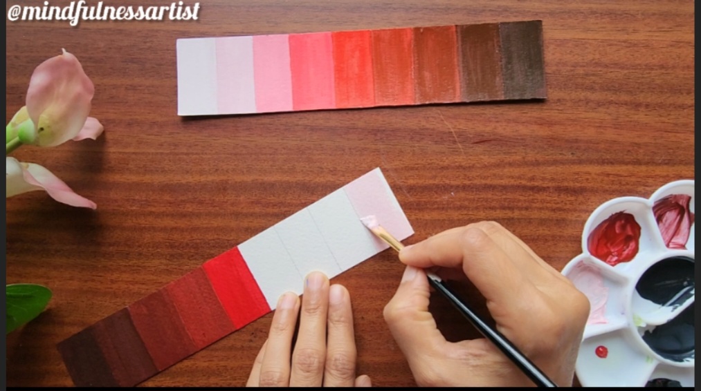
- Start with a generous amount of white on your palette.
- Add just a small touch of your pure red to the white to create a very light, pale pink.
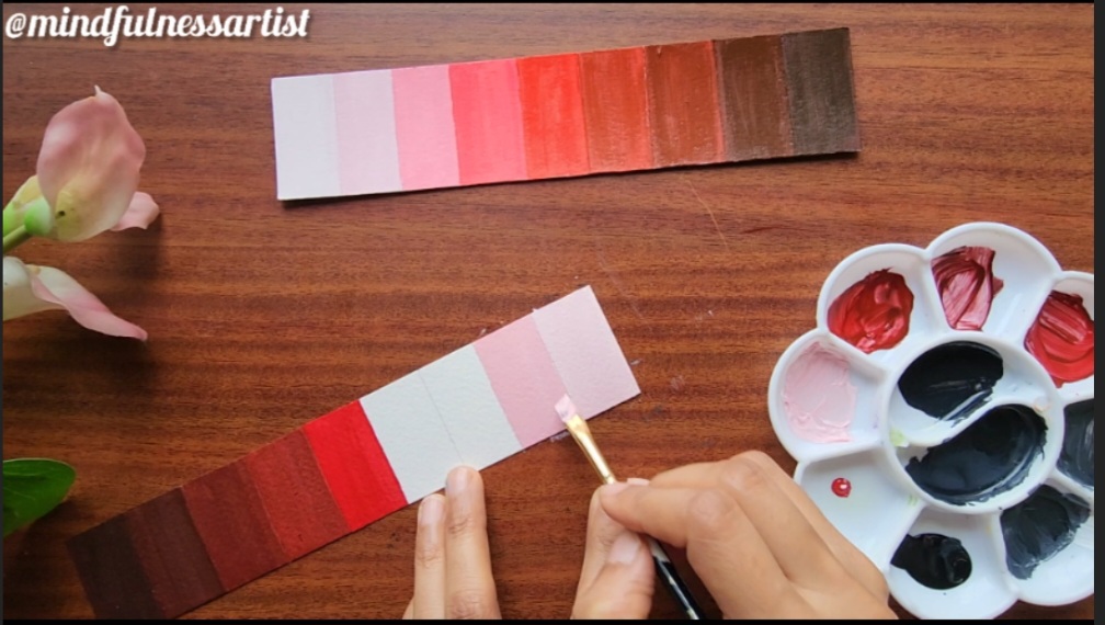
- Paint this into the box next to your pure white section .
- For the next box, add a little more red to your mixture to darken it slightly.
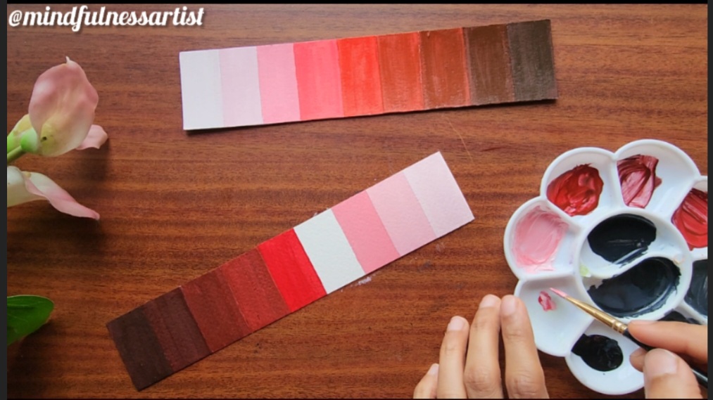
- Continue this process, adding a bit more red each time to create a series of progressively darker pinks until you reach your pure red.
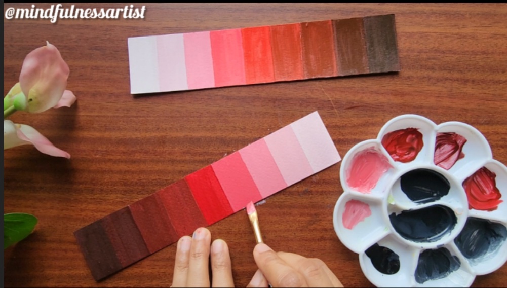
The Final Result
When you’re finished, you’ll have a complete color value scale for red, ranging from a pale pink to a dark, shadowy maroon. Repeat this exercise with other colors, like blue, yellow, or green. The more you practice, the more intuitive your color mixing will become. This skill will directly translate to your artwork, allowing you to create more realistic and dynamic highlights and shadows in your paintings.

